Interface Design for Forms: Microcopy That Guides Completion
Good interface design in forms is mostly about words. The label that names a field, the hint that appears below it, the message that shows after a mistake, and the button that invites action all shape whether someone keeps going or leaves. Thoughtful microcopy lowers effort, prevents errors, and makes the path to completion feel obvious.
Why microcopy matters in forms
Every form asks for attention and trust. People scan quickly, predict what each field needs, and look for cues when something goes wrong. If the language is unclear, they hesitate. If the language is helpful, they move forward. Small wording changes often have a larger effect than layout changes because they reduce uncertainty at the exact moment it appears.
Field labels that set expectations
A good label answers three questions at once: what to enter, in what format, and why it matters. Short labels work best, but they should be specific enough to prevent guessing.
- Use plain names, not internal terms. “Phone number” is clearer than “Contact identifier.”
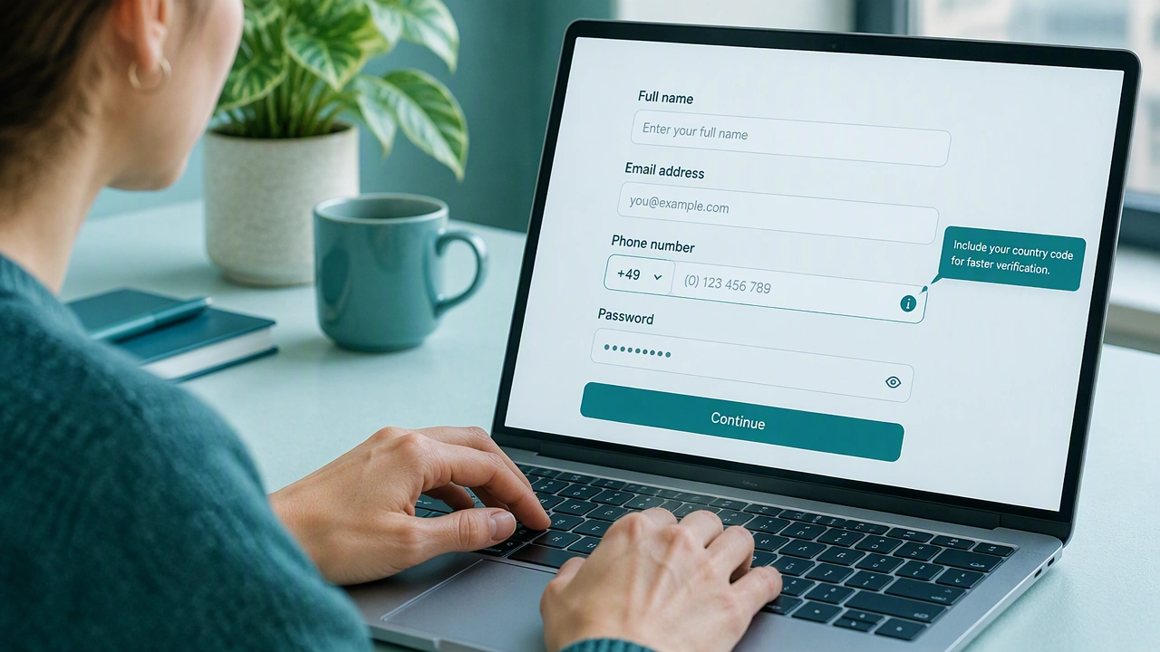
- Indicate format when it helps. “Email ([email protected])” or “Postal code (5 digits)” gives a concrete pattern.
- Avoid labels that sound like instructions. “Please enter your full legal name” is polite but long. “Full name” is enough when the context makes the requirement obvious.
- Keep optional fields obvious. Mark optional fields with “optional” rather than marking required fields with an asterisk, because many people miss the legend.
Helper text that prevents mistakes before they happen
Helper text sits below or beside a field and gives just-in-time guidance. It should be brief, visible, and focused on the most common point of confusion.
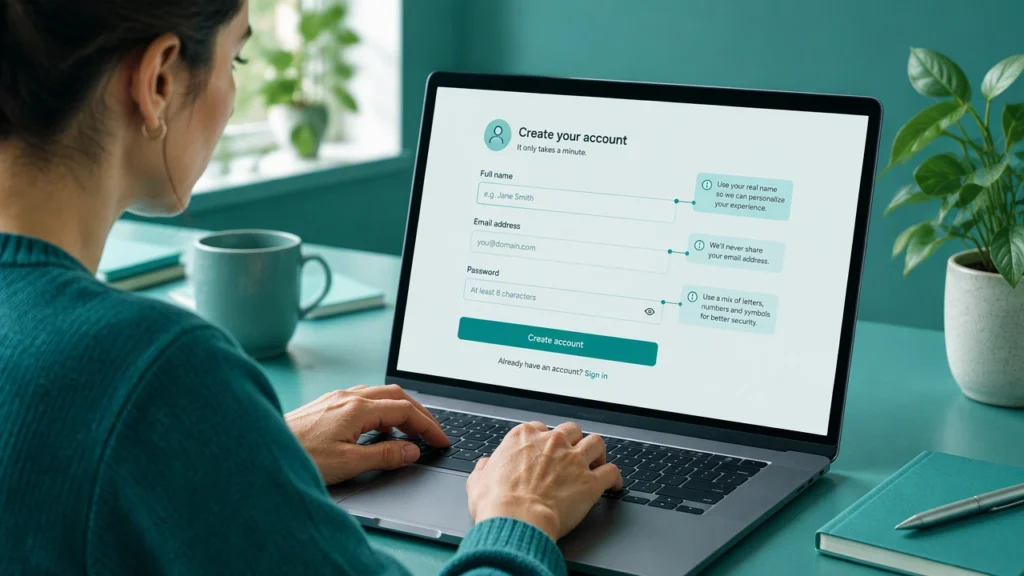
- Explain constraints, not rules. “Use 8 or more characters with at least one number” is clearer than “Password must meet policy requirements.”
- Show examples that are safe to copy. “MM/DD/YYYY” or “123-456-7890” gives a pattern without requiring a tooltip.
- Clarify what will happen next. “We will send a verification code to this number” reduces fear of unknown consequences.
- Avoid repeating the label. Helper text should add value, not say the same thing in more words.
Validation messages that guide correction
Validation works best when it is immediate, specific, and kind. People should know what went wrong and exactly how to fix it. These are some of the most useful form microcopy examples that reduce errors because they appear at the moment of confusion.
- Name the field and the problem. “Email address is missing the @ symbol” is better than “Invalid input.”
- Suggest a fix, not just a fault. “Enter a 10-digit phone number, like 555-123-4567” helps someone recover quickly.
- Keep tone neutral. “That date is in the past” is clear without sounding accusing.
- Preserve what was entered. Do not erase a value on error. Let people see and edit their text.
- Use inline messages first. Summary banners are useful after submit, but inline messages near the field are faster to understand.
Button wording that reduces hesitation
Buttons carry the final bit of momentum. Their label should describe the outcome, not the action alone. Clarity beats creativity here.
- State the result. “Create account” or “Place order” is more helpful than “Submit.”
- Include scope when it matters. “Save address” or “Save and continue” tells people what will be stored.
- Use active verbs. “Pay now,” “Request invite,” and “Start free trial” are direct and specific.
- Avoid vague words. “Continue” can be fine in a multi-step flow, but on a final screen it should say what continues happens.
Patterns that reduce abandonment
Microcopy works even better when it supports clear patterns across the form.
- Progressive disclosure. Show advanced fields only when needed, with a short explanation of why they appear.
- Inline choices. When a field depends on another, explain the link: “Billing address will be used for invoice PDF.”
- Smart defaults. If a default is likely correct, say so: “Country: United States (detected).”
- Error recovery summaries. After submit, list errors with anchors to the fields, and keep the form populated.
Accessibility and tone
Clear microcopy is also accessible microcopy.
- Pair color with words. Do not rely only on red borders to show errors. Use text that explains the issue.
- Connect messages to fields. Use aria-describedby or visible proximity so screen readers and sighted users both understand the link.
- Write for scanning. Short sentences, specific nouns, and simple verbs help everyone, especially under time pressure.
- Be consistent. Use the same terms for the same concept across the form and product.
A simple review checklist
- Does each label say what to enter and in what shape?
- Does helper text answer the most common question for that field?
- Do error messages name the field, the issue, and a fix?
- Do buttons describe the outcome of the action?
- Is the tone calm, specific, and free of blame?
Final thought
Interface design for forms is not about decoration. It is about removing doubt. When labels are clear, helper text is timely, validation is specific, and buttons describe outcomes, people finish more forms with less effort. Start with the fields that cause the most corrections, rewrite the microcopy there, and measure the change. Small, careful words often produce the biggest gains.